Saturday, April 30, 2022

M6 Isarithmic Mapping

I am fan of color! This is my jam, I mean lab. This week we were introduced to isarithmic maps, which are two-dimensional representations of a three-dimensional volume. This lab consisted of taking the state of Washington's annual precipitation data and showing it using continuous tones, hypsometric tints, and overlaying contours and hillshades. This is the best way to show the data because it highlights the elevation data and allows the map reader to see the smooth and continuous rainfall across the state. I learned about PRISM interpolation method, digital elevation model, which was created by some brilliant minded people, and that generally precipitation increases with elevation. Maps like these are great for many fields of study including, agriculture, hydrology, ecology, and engineering just to name a few. Without further ado, the map below shows the annual precipitation data of Washington state in inches with a overlaying contour and hillshade created with ArcGIS tools Int and Contour List (both Spatial Analyst Tools). It was then classified into 10 classes and symbolized using the Precipitation color ramp.

Comments: This was lab was nice and straightforward. No issues and it ran smoothly. I could see myself liking this side of GIS in the future very much, because I see the potential it can have in various fields. It is also fun to see a rainbow of colors on my map and it not be against any map guidelines.

Saturday, April 23, 2022

M5: Choropleth and Proportional Symbol Mapping

This week in Computer Cartography class we were introduced to Choropleth maps, which is best used for standardized data. Also, Graduated or Proportional symbols used can make a difference in how the map looks. For the map below, Graduated symbols were utilized to show the comparison between population density and wine consumption from European Countries from 2012 data. You can see that once the data is standardized the size of a country and the wine consumption are not influenced by one another. One thing that did come to light is the Vatican City wins this round with 73.78 liters per capita consumed.

Comments: This lesson was enlightening, but easily confusing as well. The pros and cons of choosing symbols depend on the data, the audience, and the map maker. I wish I knew a better way to make inset maps, but as a map making padawan in only my second semester, the frame within a frame is my only card so far and I could not figure out how to hide data from the extent frame. It will keep me up at night for sure until I figure it out.

Friday, April 15, 2022

M4: Data Classification

This week we dove into data classifications, with an overall goal to represent the four most common ones: equal interval, quantile, standard deviation, and natural breaks. I learned how each one works, and the best ways to use them...along with the pitfalls they may have. The map below is a map that presents the 2010 Census Tract for Percentage of Senior Citizens 65 and up in Miami-Dade County, Florida utilizing the four classification methods from lecture. This shows how each method displays the same data and allowed me to see them up close and personal.

Overall, this lecture and lab was extremely beneficial to my GIS future. Maps are meant to depict data and knowing how to do that accurately is very important to a successful career.

Sunday, April 10, 2022

M3: Cartographic Design

This week I learned about how to create visual hierarchy, figure-ground distinctions, contrast and balance. In the map below of Washington D.C. you can see Ward 7 public schools showcased by utilizing these concepts. Using lighter colors for the background and bolder colors for the schoool symbology brings them forward and does not overwhelm the eye, but also distinguishes their different school types. The placements of data around the central map shows an overall balance top to bottom and left to right as best I could manage.

I really enjoyed learning about these finer details of Cartography and did not run into any issues with the lab assignment. My only hiccup, is that I could spend hours on one element and still change my mind, and choosing symbology colors is difficult.

Saturday, April 2, 2022

M2: Typography

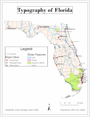
For this lesson I took a journey into why and how typography is important and the impressions it can have on a viewer. If you did not know before, it is very common for water features to be represented by blue italic text, which distinguishes them from cities or other features labeled on a map. Type distinctions can be in the form of nominal or ordinal differences, and how one represents them can aid a viewer to a easy and fast interpretation. For the map below, you can see that it is clearly Florida, but there are differences in the way water features, cities, and the capital are represented, all of which done with typography. This lesson was informative and shows that even the smallest of details can have a large impact on a map.

Three customization I made are I chose to represent the Capital of Florida by a red star making it stand out amongst the other cities. Second, I was unable to see the river name colors of turquoise dust from the lab instructions, so I chose a bolder blue for the labeling and a lighter blue for the polylines. Lastly, I utilized two different fonts. Sans Serif for towns, and most of my map elements, and Budoni for water, swamps (both in italic) and the title. I noticed I was unable to make Sans Serif italic, but Budoni from the lab instructions had an italic option, so that forced my hand a bit. All accomplished using the Label option in ArcGIS, Convert to Annotation, SQL Query, and Symbology tools for typography changes.

Additional comments: Some setbacks and struggles occurred, mostly due to me being a beginner, but learning new things in ArcGIS is always welcome. A tip to my future self would be to be make sure I see the entire map before using the convert to annotation tool. I continue this journey with a smile and another lesson in my cartography toolkit.

GIS Portfolio

The final assignment in the GIS Certificate Program was to create a GIS Portfolio. It went as I expected. It is hard to write about yourself...