Showing posts with label Cartographic Skills. Show all posts

Thursday, May 5, 2022

M7: Google Earth

This is the final week of Computer Cartography and it was ended by creating KMZ from ArcGIS, a Google Earth map, and a Google Earth Tour all of South Florida. This was my second time taking ArcGIS layers and creating a KMZ file out of them. Always good to practice these tasks more than once, so this portion was not new to me. I then created a KMZ within Google Earth Pro highlighting 6 areas of South Florida as a video tour. Quite a wonderful feature within Google Earth, because you can zoom around, tilt the view and see the 3D buildings they have created within, and really get a feel for an area. The map below is a screenshot of my creation of this map and tour assignment with all the layers turned on.

\

Comments: I truly learned a great deal in this class that will help me along the way. This final lab was a great insight into some of the technology available and it went smoothly.

Saturday, April 30, 2022

M6 Isarithmic Mapping

I am fan of color! This is my jam, I mean lab. This week we were introduced to isarithmic maps, which are two-dimensional representations of a three-dimensional volume. This lab consisted of taking the state of Washington's annual precipitation data and showing it using continuous tones, hypsometric tints, and overlaying contours and hillshades. This is the best way to show the data because it highlights the elevation data and allows the map reader to see the smooth and continuous rainfall across the state. I learned about PRISM interpolation method, digital elevation model, which was created by some brilliant minded people, and that generally precipitation increases with elevation. Maps like these are great for many fields of study including, agriculture, hydrology, ecology, and engineering just to name a few. Without further ado, the map below shows the annual precipitation data of Washington state in inches with a overlaying contour and hillshade created with ArcGIS tools Int and Contour List (both Spatial Analyst Tools). It was then classified into 10 classes and symbolized using the Precipitation color ramp.

Comments: This was lab was nice and straightforward. No issues and it ran smoothly. I could see myself liking this side of GIS in the future very much, because I see the potential it can have in various fields. It is also fun to see a rainbow of colors on my map and it not be against any map guidelines.

Friday, April 15, 2022

M4: Data Classification

This week we dove into data classifications, with an overall goal to represent the four most common ones: equal interval, quantile, standard deviation, and natural breaks. I learned how each one works, and the best ways to use them...along with the pitfalls they may have. The map below is a map that presents the 2010 Census Tract for Percentage of Senior Citizens 65 and up in Miami-Dade County, Florida utilizing the four classification methods from lecture. This shows how each method displays the same data and allowed me to see them up close and personal.

Overall, this lecture and lab was extremely beneficial to my GIS future. Maps are meant to depict data and knowing how to do that accurately is very important to a successful career.

Sunday, April 10, 2022

M3: Cartographic Design

This week I learned about how to create visual hierarchy, figure-ground distinctions, contrast and balance. In the map below of Washington D.C. you can see Ward 7 public schools showcased by utilizing these concepts. Using lighter colors for the background and bolder colors for the schoool symbology brings them forward and does not overwhelm the eye, but also distinguishes their different school types. The placements of data around the central map shows an overall balance top to bottom and left to right as best I could manage.

I really enjoyed learning about these finer details of Cartography and did not run into any issues with the lab assignment. My only hiccup, is that I could spend hours on one element and still change my mind, and choosing symbology colors is difficult.

Saturday, April 2, 2022

M2: Typography

For this lesson I took a journey into why and how typography is important and the impressions it can have on a viewer. If you did not know before, it is very common for water features to be represented by blue italic text, which distinguishes them from cities or other features labeled on a map. Type distinctions can be in the form of nominal or ordinal differences, and how one represents them can aid a viewer to a easy and fast interpretation. For the map below, you can see that it is clearly Florida, but there are differences in the way water features, cities, and the capital are represented, all of which done with typography. This lesson was informative and shows that even the smallest of details can have a large impact on a map.

Three customization I made are I chose to represent the Capital of Florida by a red star making it stand out amongst the other cities. Second, I was unable to see the river name colors of turquoise dust from the lab instructions, so I chose a bolder blue for the labeling and a lighter blue for the polylines. Lastly, I utilized two different fonts. Sans Serif for towns, and most of my map elements, and Budoni for water, swamps (both in italic) and the title. I noticed I was unable to make Sans Serif italic, but Budoni from the lab instructions had an italic option, so that forced my hand a bit. All accomplished using the Label option in ArcGIS, Convert to Annotation, SQL Query, and Symbology tools for typography changes.

Additional comments: Some setbacks and struggles occurred, mostly due to me being a beginner, but learning new things in ArcGIS is always welcome. A tip to my future self would be to be make sure I see the entire map before using the convert to annotation tool. I continue this journey with a smile and another lesson in my cartography toolkit.

Sunday, March 27, 2022

Mod 1: Map Critique

For this lesson we were tasked to evaluate a well-designed map and a poorly-designed map. Using Map Design Principles as well as the 6 Commandments I provided the following synopses:
Image Source: S:\GIS4006\Module1\ExampleMaps\EasterIsland
Evaluation Synopsis: This map of Easter Island deserves an overall grade of being well-designed. Its intention to give the reader a general layout of Easter Island is a well-executed success. It effectively follows the following map design principles: #1. Graphical excellence in the presentation of data. #2. It displays complex ideas communicated with clarity, precision, and efficiency. #7. It is clear, detailed, and thoroughly labeled as to not distort. It follows all 6 commandments with ease. It appeals to my map aesthetic because it has a historical meaning of showing the various ruins and platforms located there, which touches on my passion for history and learning. It also is colorfully pleasing to me, as in it uses pastel hues that are not loud or distracting. Lastly, it is effective in getting the objective across without being overwhelming. Everything in its place has a purpose and makes sense where it was placed.
Image Source: S:\GIS4006\Module1\ExampleMaps\WildlifeAndGameMap
Evaluation Synopsis: This map of the Wildlife and Game in the United States gets an overall grade of poorly designed. It is too chaotic breaking many map design principles such as #1. Graphical excellence is the well-designed presentation of interesting data. #2. Graphical excellence with complex ideas communicated with clarity, precision, and efficiency. #3. Graphical excellence to give the viewer the greatest number of ideas in the shortest time with the least ink and the smallest space. It breaks these because you could stare at this map all day and not see the same thing twice or gather the info you seek. The legend is placed all around the image in a haphazard manner forcing the viewer to look back and forth from the legend to the map. It is not clear, precise, or efficient in getting the objective across. The legend does not convey meaning towards the map itself, but rather duplicates information because animals depicted are not solely seen in just one spot of the map. This map broke all 6 commandments when it was made. Three areas of improvement I would address would be to make sense of the animals in the legend along the map neat line as in they could be placed alphabetically. I would also add a clearly visible scale and north arrow at the bottom of the map above the title. Lastly, I would take out any redundancy because there appears to be more animals located on the map than there are in the legend.

Final Comments: This lesson is a good challenge because I had a set of principles and commandments to follow when critiquing, and because the map may not be what I would of chosen it does not mean that I am unable to come up with an evaluation. It forced me to look not only at the objective of the map, but also beyond to see the finer details from an outsider's view. Paying attention to other maps will certainly come in handy when I am developing my own, so I can either do mine similarly or learn from the mistakes of others.

Wednesday, March 9, 2022

About Me

My name is Jenna Clevinger, and I joined the UWF GIS Certificate Program in hopes of combining my BA in Anthropology with GIS for an exciting new career. I gained an interest for maps while I was enlisted in the U.S. Navy for 8 years as a Quartermaster. During my time I learned all about navigation and was able to have some interesting land and underwater archaeology volunteer opportunities in my travels. I hope to gain enough knowledge from the program to get my foot in the door of a surveying or realted GIS career. I have drive, passion and willingness to learn. Having a GIS related career my goal, but you never know where life will take you, so I am open to exploration along the way. My Story Map is here.

Monday, November 22, 2021

Mod 5: Supervised Classification Exercise

This week we learned about Unsupervised and Supervised Classifications. The map above is a Supervised Classification where we were given an image from Germantown, Maryland and tasked with dividing it amongst 8 classes (Agriculture, Deciduous Forest, Road, Urban, Mixed Forest, Grass, Fallow, and Water) to make a land use map for their future planning. Using ERDAS Imagine I was able to create polygons for some signatures or utilize the AOI Seed tool to grow my own. By collecting the signatures, evauluating them, classifying the image, merging the classes and calculating area the process read from lecture has come to reality. Taking into consideration Spectral Euclidian Distances and Neighborhood, then checking the histograms and signature editor columns for clarification I think the output map was an overall success in this lab. The concepts involving the histogram plots, layers and bands are still a little fuzzy in my head, but exercises like this are very helpful in making things clearer.

Tuesday, November 16, 2021

Mod 4: Spatial Enhancement, Multispectral Data, and Band Indices

This week we dove into the deep end of trying to find features based on feature descriptions or clues in pixel data given to us. By using what I learned in the lectures and lab exercise I was able to locate the 3 descriptions In ERDAS Imagine by either examining the histogram, visually examining the image as a grayscale or multispectral, and using the inquire cursor to find brightness values. Below are 3 maps showcasing the features for each of the 3 descriptions (clues) I was given to find.
This map above shows that water is the feature causing the Layer_4 spike between pixel values of 12 and 18. I found it by looking at the tm_00.img as a grayscale and looking for the darkest features because the spikes between the pixel values of 12 and 18 were on the left side of the graph. As we learned spikes on the left indicate dark in that band, so I concluded it must be the water by visual and the inquire cursor steps. I chose to display the feature in a False Color IR (R=4, G=3, B=2) because the red to black color made it stand out the best.
The map above shows that snow/ice is the feature that a. causes a small spike in layers 1-4 around pixel value 200, and b. a large spike between pixel values 9 and 11 in layer_5 and layer_6. I found snow and ice by looking for something bright because of the pixel value of 200 at the true color tm_00.img and the snow covered mountains were definitely the brightest. Then with the panchromatic image in another pane I could look there to see layers 5 and 6 pixel spike values 9 and 11, and I knew I was looking for something dark. The snow/ice covered areas met both the a. and b. criteria we were looking for. I chose the False Natural Color (R=5, G=4, B=3) to display them because it made the feature stand out in a bright baby blue color.
The map above shows that shallow and deep water is the feature causing certain areas of water in layers 1-3 to be brighter, layer 4 becomes somewhat brighter, and layers 5-6 remain unchanges. This area shows that variation in water. The hint was already there that we were looking for variations in water, so I experimented with different band combinations and looked near land where I knew I might see variations. (The Navy sailor in me was helpful as well, but that’s just my own experience being useful I think) Sure enough I could tell where shallow water was and where the darker deep water was, so those are the only water variations that I could tell and I feel like my hunch was correct here. I ended up using a R=3, G=2, B=1 band combination because that was the clearest to me. Overall, this was a tedious and difficult task. I tried to make it sound simple above, but there was so much confusion and fumbling between the lab and book pages on my end. Hopefully it was a success, but I do have some unease about this topic still.

Monday, November 8, 2021

Mod 3: Intro to ERDAS Imagine

This week we were introduced to a new program called ERDAS Imagine. It appears similar to ArcGIS Pro when you first open it, so nothing to be too intimidated by I hope. The above map image is a smaller image subset from a larger image given to us from a forested area in Washington State. Task included to create the random subset, add an area column to the attribute table, and take the image to ArcGIS Pro to set unique values to the parts of the forest being represented by the pixels and complete the map layout. Not bad for a first go at it from my seat. Looking forward to working with ERDAS Imagine in the future.

Tuesday, November 2, 2021

Mod 2: Land Use/Land Cover and Ground Truthing

This week we went all the way to Pascagoula, Mississippi in a aerial photo of course for a exercise in Land Use and Land Cover to a Level II classification. In the map above you can see the different uses and covers in polygons, and then randomly choses points to test out my interpretation. With a accuracy of 90%, I'd say I am pretty good at seeing features for what they truly are. With a few changes over time in the town, a little error is to be expected. Things are going well in class so far.

Monday, October 25, 2021

Mod 1: Visual Interpretation

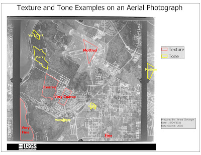
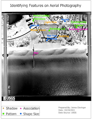
Start of a new GIS Course: GIS 4035 Photo Interpretation and Remote Sensing. This first lab we created 2 maps, the top one showing examples of textures, tones, and the bottom map shows examples of features that can be interpreted by shape or size, shawdow, pattern an association in aerial photos given to us. Seeing how features look on photos can help interpret them to what they are showing. This can be seen in the homes, buildings, swimming pools, piers and even parking lots I chose. They all have distinct characteristics as we have learned this lab that define their identity. Great first introduction assignment executed well!

GIS Portfolio

The final assignment in the GIS Certificate Program was to create a GIS Portfolio. It went as I expected. It is hard to write about yourself...